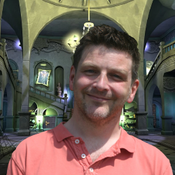
Rare Gamer Interviews Grabbed by the Ghoulies Lead Environment Artist, Steven Hurst (October 18th 2018)
 It should come as no Super Scary Shock that we’re massive fans of Grabbed by the Ghoulies – the haunted house romp is still a holiday favorite every Halloween and its inclusion in Rare Replay makes it that much easier to pick up and play with added achievement incentive. We can look back to each room featured in Ghoulhaven Hall fondly, so it was an absolute joy to get a chance to speak with the architect of the mammoth manor when we caught up with Steven Hurst. While he calls Playtonic Games home now, he started at Rare with games like Donkey Kong Country 2: Diddy’s Kong Quest and Banjo-Kazooie before his ‘background work’ took a forefront as Lead Environment Artist.
If you’ve taken any time to enjoy the scenery in Banjo-Tooie, Grabbed by the Ghoulies, Viva Piñata or Banjo-Kazooie: Nuts & Bolts then you’ve probably been looking at his work without knowing it.
Join us as we look into the development of Grabbed by the Ghoulies, taking a good hard look through Baron Von Ghoul’s home, and even learning which room Steven Hurst calls his favorite! Spooky stuff to be sure!
What was it like working on Grabbed by the Ghoulies, and how was it different from working on something like Banjo-Tooie?
Working on Ghoulies was great because we got to use some shiny new hardware! We`d been working on the N64 for quite a while (with the two Banjo games) and I think it`s pretty safe to say that we had pushed that machine as far as it could go, so the chance to work with a more powerful machine was very exciting. It was also nice to work on something that wasn`t Banjo as well!!
What tasks did you have as an environmental artist in Grabbed by the Ghoulies?
My role on Ghoulies was lead environment artist. This meant that as well as creating some of the rooms and locations of Ghoulhaven Hall I also had to oversee the other environment artists so that there was a consistency across the project. Each artist was the `owner` for a set of rooms and they would be responsible for all aspects of them from initial modelling, through to texturing and lighting.
Beating Challenge 21 and unlocking the secret ‘E3’ video shows the game underwent quite a bit of change from the Gamecube era, what was your experience in refining the style of Ghoulies we would eventually see in the Xbox release?
The gamecube version in that video is actually a very,very early demo (possibly only a month into production). I don`t think we changed much style-wise in the shift over to xbox – it`s just that in that video we were still finding our feet with the hardware.
The final look and textures in the game are more cartoony than that early demo and I think that this was just a natural development in tying the characters and background together in a cohesive style.
A lot of people who had missed out on Ghoulies the first time were able to play it on Rare Replay where they were taken back by how well the visuals had stood the test of time. What do you think helped Ghoulies to retain its lasting charm?
It surprised me too! We always wanted the game to look like an interactive cartoon more than a videogame so I think the simple, bold style is something that doesn`t really age compared to more `realistic` games. We were also using some pretty cutting edge lighting techniques that are still used today.
All the lighting in the game uses baked lightmaps which is pretty much still the standard system that most modern games use (albeit in a more refined way!).
Do you have a favourite room that you worked on? Were there any that were cut before they could make it into the final game that you had worked on?
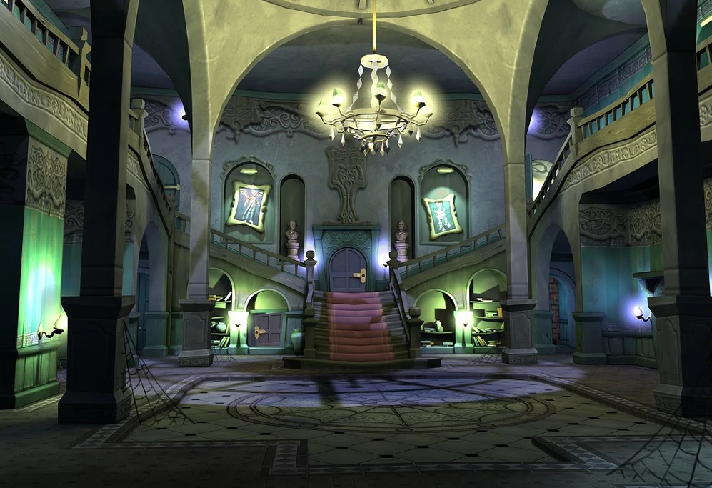
I think my favourite is the grand entrance hall that you enter at the start of the game. This was the very first room I worked on and although it went through a few different iterations it stayed close to my original vision of it. I think it sets the tone of the game really well. I don`t think we had to cut any rooms – certainly none that had progressed past the early planning stages.

Which room or area in Ghoulhaven Hall was the most challenging to work on?
Probably the entrance hall that I just mentioned, but only in the sense that it was very much a `testbed` for techniques and methods that we would use throughout the game. Generally most of the rooms and areas were pretty straightforward as most of them were essentially static `sets`.
There are a lot of destructible objects and environments in Grabbed by the Ghoulies, how did that effect the way the game was developed on your end?
A lot of the destructible background stuff was actually added quite late in the games development. It was a bit fiddly to have to go back and `break apart` the elements that design said should be breakable, although we did reuse lots of the same objects across the different rooms.
In the Upper Corridors, there’s a barred off area where you can see a stash of Bonus Books arranged in a question mark– can we blame you for the hours we spent trying to wedge Cooper through the bars? How does something like this work its way into the game?
Hah! – nothing to do with me, that one 🙂 We always liked to put stuff in there that made the player wonder if there are any secret areas in the game – who knows, maybe you can get through somehow and nobody`s worked out how yet? 😉
There’s another hidden reference in the Servants Quarters, where the only ‘Franky Says’ shirt in the game can see seen – was this something significant to the Ghoulies team, perhaps an in-joke that slipped its way into the laundry?
I can`t remember it having any particular significance – I think one of the artists must have had a fixation with the 80`s!
On that note, do you have any anecdotes from working on the game that bring back fond memories?
Looking back I do think that Ghoulies was certainly one of the easier (in terms of development) games I`ve ever worked on! – everything went pretty smoothly 🙂 I look back with fond memories on all the games I worked on as part of the `Banjo` team- we had a lot of fun working on them and I think that really comes across in the final games.
Lastly, what advice would you give to anyone looking to break out in a career working in games as an artist?
This is something I get asked quite a lot and it always comes down to the same thing – be original!
I`ve seen lots of game art portfolios over the years and quite often you see the same stereotypical `themes` cropping up time after time. Usually the ones that stand out may not be the most technically accomplished but they show something that I haven`t seen before – unique ideas!
We’d like to extend our thanks to Steven Hurst for his time and all of the years we’ve spent wandering through his memorable worlds. Perhaps someday we’ll manage to squeeze through the bars in the Upper Corridors and snag all of those illusive Bonus Books yet…
Categories: Interviews
0 Comments
This post has been left all alone with no comments. Don't leave it lonesome - give it some company with a comment.